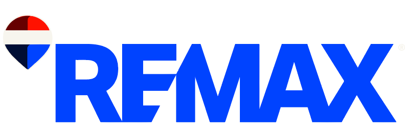
For decades, the red, white, and blue RE/MAX balloon has floated high above the real estate landscape, becoming one of the most recognizable emblems not only in property sales but in global branding. Its cheerful ascent has symbolized trust, professionalism, and the aspirational spirit of homeownership. Yet, even timeless icons must evolve — and this week, RE/MAX unveiled a bold new chapter in its visual identity.
The global real estate powerhouse has introduced a “digital-first” logo that preserves the essence of the legendary balloon but updates it for the modern, fast-paced world of online media. The refreshed design features simplified shapes, cleaner lines, and a more contemporary aesthetic designed to perform better across digital platforms — from mobile apps to social feeds and video marketing.
A Modern Identity for a Modern Market
According to Abby Lee, Executive Vice President of Marketing for RE/MAX, the update isn’t a complete rebrand but a strategic evolution. “We’re not talking about a full-blown refresh — that will come later,” Lee explained. “The goal right now is to help our agents show up better, day in and day out, in social media channels and digital advertising.”
The redesigned logo was developed in partnership with creative agency Camp + King, blending heritage with innovation. It keeps the familiar silhouette of the RE/MAX balloon while embracing a sleeker, more versatile look that aligns with how consumers now interact with brands online.
Reviving the Brand’s “Swagger”
RE/MAX CEO Erik Carlson addressed the new design during a recent investor call, noting that the company — which has faced challenges with declining revenue and agent count — is aiming to “strengthen our swagger.” The new branding, he said, is part of a larger effort to reenergize the organization and reconnect with both agents and clients.
Survey data released by RE/MAX suggests that the redesign is already achieving its intended effect. In consumer testing, the updated logo outperformed both the previous version and those of major competitors in terms of appeal to potential home buyers and sellers. Notably, 78% of respondents recognized the new balloon as RE/MAX, even without the accompanying wordmark, underscoring the enduring strength of the brand’s visual equity.
A Divided Reaction — and a Lot of Buzz
As with any major rebrand, public reaction has been mixed. On social media, some RE/MAX agents praised the new logo as fresh, forward-looking, and perfectly suited for digital marketing. Others expressed concern over the costs of updating signage, materials, and websites, or lamented what they saw as a loss of the brand’s traditional “balloon” personality.
Meanwhile, on Reddit and design forums, comparisons emerged between the new RE/MAX balloon and the Pepsi logo — a testament to how even subtle design changes can ignite passionate debate among both professionals and fans.
Regardless of opinions, one fact is undeniable: people are talking about RE/MAX. The conversation alone signals a successful brand refresh, keeping the company front of mind in an increasingly competitive real estate industry.
An Icon That Continues to Soar
When RE/MAX celebrated its 50th anniversary in 2023, Lee called the balloon “the most powerful image in real estate.” That statement still rings true today. The redesigned emblem represents not an abandonment of the past but a confident leap into the future — a symbol of adaptability and optimism in a market that’s constantly changing.
In a world where brand relevance depends on digital presence, RE/MAX’s modern balloon reminds us that even legacy icons can rise higher when they embrace innovation.